The Interrelationship Digraph
The interrelationship digraph is a sophisticated conceptual tool for both planning, and root cause analysis. It’s also one of my favourites! Problems and projects are often messy, complicated, and have multiple interdependent elements. This tool provides the intellectual clarity to analyse and solve complicated problems. In this article I’ll show how I’ve used this tool in practice.
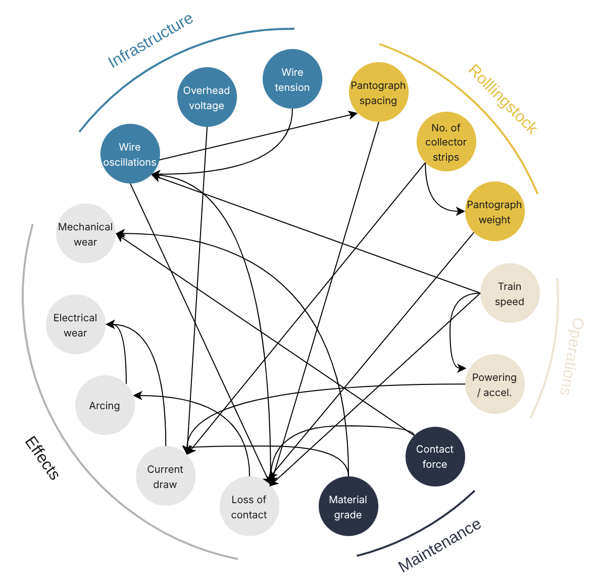
An interrelationship digraph showing causal factors affecting collector strip wear on train pantographs.
🧭 Navigation
About The Tool
The interrelationship digraph is one of the 7 “new” management and planning tools 1 2:
- Activity Network Diagram
- Affinity Diagram
- Interrelationship Digraph
- Matrix Diagram
- Prioritisation Matrix
- Process Decision Program Chart
- Tree Diagram
This particular tool maps the dependencies between elements in a set. Many people mistakenly refer to this tool as the interrelationship diagram, but the word digraph is a portmanteau of the phrase directed graph. It is a graph showing a directed - or one-way - relationship between elements. Tracing out these one-way paths reveals important insights for problem solving and project planning.
First, I’ll show the basic steps to implement the tool. Then, I’ll show how I’ve used it in practice.
Using the Tool
1. Enumerate all the elements 🔢
The first step is to list out all the elements. This could be all the tasks required to complete a project, or all the known symptoms and causes in a problem. Organisation at this stage doesn’t matter; the important thing is to get all the information out of your head, and on paper or a whiteboard.
Best results are obtained by doing this in a group brainstorming session. Write down every individual element on a Post-It note, and place them on a whiteboard!
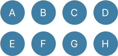
2. Arrange all the items in a circle ⭕
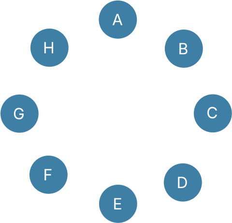
The next step is to organise all the elements in a circle. Again, ordering here matters (you can always modify it later once the nature of the relationships becomes more apparent). We simply want to create space - and a bit of structure - for mapping out the relationships.
3. Draw the arrows ➡️
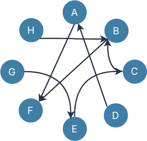
Now connect all the elements in a set by dependency, or causality. For example, in the image below I have drawn the relationship A > F. This can be interpreted two ways:
- In task planning, task F cannot be started until task A has been completed.
- In root-cause analysis, event A causes event or outcome F.
4. Analyse the nodes 🕵️
Here is where the power of the interrelationship digraph is revealed. Count the number of arrows in and the number of arrows out for every element. It’s a good idea to tabulate them. There are 3 specific types of nodes to look for:
- Nodes with zero arrows in; only arrows out,
- Nodes with zero arrows out; only arrows in, and
- Nodes with multiple arrows in, and only one arrow out.
| Feature | Root Cause Analysis | Project Planning | |
|---|---|---|---|
| No Arrows In | 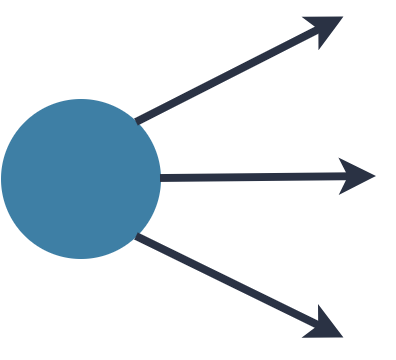 |
A root cause. Rectifying this should solve the problem. | An initial task that commences the project. |
| Multiple In, One Out | 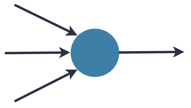 |
A critical failure point; many problems will manifest here. | A bottleneck; it is dependent on the timely completion of multiple tasks. An excellent candidate for a project milestone. |
| No Arrows Out | 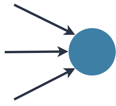 |
A symptom. This is easily observed and typically what instigates the root cause investigation. | The final activity which signals project completion. |
Here is the analysis for the example above, and how I’d treat each node:
| Node | Arrows In | Arrows Out | Planning | Problem Solving |
|---|---|---|---|---|
| A | 1 | 1 | ||
| B | 2 | 1 | Track progress prior tasks C and H carefully as this could hold up the project. | A critical point; many symptoms will manifest here. |
| C | 1 | 1 | ||
| D | 0 | 1 | Start point for the project. | A root cause; aim to fix this. |
| E | 1 | 1 | ||
| F | 2 | 0 | A symptom; treating this won’t solve anything. | A final task; its completion time must align with the project end date. |
| G | 0 | 1 | Start point for the project. | A root cause; aim to fix this. |
| H | 0 | 1 | Start point for the project. | A root cause; aim to fix this. |
5. Follow-Up
You’ve done the analysis; now what?
If you’re doing project planning, a good follow-up project management tool is an arrow diagram, or PERT. The circle can be re-arranged to show sequencing. Then it’s possible to determine completion times, slack, etc. The bottleneck of the interrelationship digraph will align with the critical path in the PERT diagram.
If you’re doing root cause analysis, the follow-up would be a brainstorming or problem-solving workshop to identify how to fix those problems.
Examples in Practice
Sydney Trains Late Arrivals
Way back in 2013, when I worked for Sydney Trains, my manager asked me to do some data analysis for late trains arriving at Central station. The same trains were late almost every morning. For example, trip number 154A was consistently late arriving from Western Sydney (now referred to as the T1 line).
Digging through the database of reported train delays, I traced out the trip numbers for the assigned blame of every trip. To make sense of all these connections, I developed my very first interrelationship digraph, which you can see below:
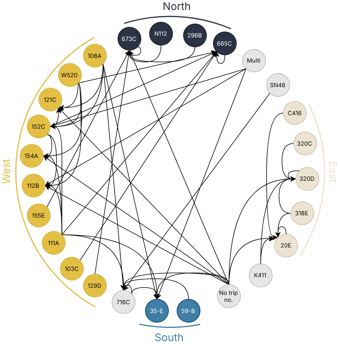
The first thing you’ll notice is that the causes for train delays are complicated. If you look at a network map for Sydney Trains you’ll see why:
- Multiple train lines converging toward the city centre
- Multiple interchange stations causing bottlenecks in the rail network
The data reflect this; the majority of train delays are from the Western lines, with only 2 from the South, as this train line is relatively isolated.
One thing that really stood out: trip 111A. If I recall correctly, this train departed from Emu Plains around 6:00 or 7:00 in the morning, yet was causing trains to arrive late at Central station at 9:00! Train delays were propagating through time and space across the rail network.
Management were focusing all their attention on late arrivals to Central, but the root causes were a 2-hour train trip away on the other side of Sydney!
Pantograph Collector Strip Wear
Whilst working for Sydney Trains, I ran a project investigating carbon collector strip wear on train pantographs. The pantograph is the mechanical arm that connects a train to an overhead powerline. On top is a sacrificial component called a collector strip that is changed out when it wears out.
On the OSCAR and V-Set intercity train fleets, these were wearing out in a few months, causing in-service failures and high maintenance costs. As part of my investigation, I developed this interrelationship digraph shown at the top of the page to illustrate all the interdependent relationships between elements:
There are many engineering design factors that must be considered when using an overhead powerline:
- Wire tension,
- Distance between consecutive pantographs on the train,
- How much power it supplies,
- Etc.
But at the same time, there are operational demands on train speed, train size, etc. to meet customer demands.
One thing you’ll notice in the digraph: loss of contact is a bottleneck. When the pantograph loses contact with the wire, it causes electrical arcing, which destroys the collector strip. It was evident from inspection that there was significant arcing.
Importantly, there were 2 variables within the remit of the maintenance department:
- Contact force, and
- Material grade.
My investigation determined that the contact force was too low, and the material was too electrically resistive. The causal relationships I mapped out in this digraph made a powerful narrative piece to explain to project stakeholders.
Project Planning
This example is part of a project planning workshop I did when working at the Italian Institute of Technology. We had to do an interactive demo with a humanoid robot at the International Conference on Robotics and Automation in London in 2023. We had a strict deadline, and only a few months to make everything work!
As per my instruction, we:
- Wrote down all the tasks we needed to do on Post-It notes, then
- Mapped the logical dependencies between tasks.
For example, we needed to improve the reliability of the human attention detection in the vision module, but there was no point optimising this until we fixed issues with ambient lighting obscuring the robot’s vision.
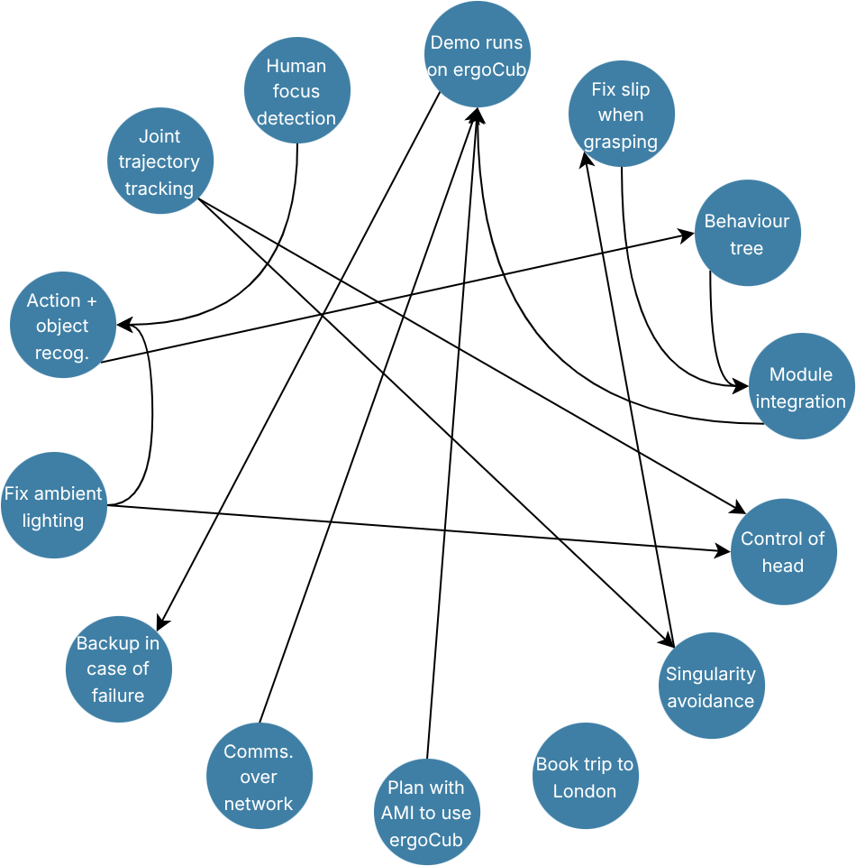
You can see in the diagram there are a few bottlenecks where tasks converge:
- The vision system getting confused about action recognition when a person is also holding an object,
- Module integration between object detection, human detection, and control, and
- Making sure everything runs seamlessly on the real robot.
These became project milestones, which we marked in our Gantt chart. By paying careful attention to these, we ensured the project wouldn’t be delayed.
As a follow-up to this tool, we:
- Re-organised it into the activity network diagram / PERT, and then
- Used this to produce a Gantt chart in GitHub projects.
This became our method of monitoring and reporting on project progress.
I really liked this tool because it helped us to answer some very important questions:
- “Where do we start?”,
- “What could hold us up?”, and
- “How do we know when we’re done?”.
Key Takeaways
- Digraph is a portmanteau of directed graph and maps one-way relationships between elements in a set.
- It can be used for root cause analysis, or project planning.
- It helps to determine where to start, what to solve, and what to monitor in a problem or project.
- Reality is complex, and this tool helps makes sense of it!
References:
-
Mizuno, S. (Ed.). (1988). Management for quality improvement: The 7 new QC tools. Productivity Press. ↩
-
As opposed to the 7 basic tools of quality. ↩